 I think this concert poster for The Strokes uses effective design. It is simple but eye-catching. The white space actually works well with the poster because it accentuates the band's name. Once the audience would see this, they would become interested to know what it is a poster for. The pink in the Strokes word is the only splash of color, which accentuates it that much more. Even the diagonal of the building leads your eye to the concert information.
Tuesday, November 24, 2009
Concert Poster
I think this concert poster for The Strokes uses effective design. It is simple but eye-catching. The white space actually works well with the poster because it accentuates the band's name. Once the audience would see this, they would become interested to know what it is a poster for. The pink in the Strokes word is the only splash of color, which accentuates it that much more. Even the diagonal of the building leads your eye to the concert information.
Tuesday, November 3, 2009
Good Magazine Layout

I find that People magazine has an effective cover layout. The magazine has a very bold title, which is always easy to recognize, even in this case where Andre Agassi's head is covering part of it. Readers still understand what it says. The title story is always the biggest part of the cover because it is the most important part of that particular issue, and then other important stories run down the side. The layout is balanced nicely and highlights the stories to a good extent. The colors of the magazine also are always used in an effective way, by using attention-grabbing colors, but by not being too overpowering to the point where it would look cheesy and cheap.
Monday, October 26, 2009
Business Card
 I believe this business card is effective because of the professionalism it portrays. It looks organized and has a clean design. I also like that both sides have the logo on it. This business is a graphic design and advertising company, and by looking at their business card, I would trust that they would do a good job with my business. I am more apt to think they would do good because of their good graphic and design on their own business cards.
Tuesday, October 20, 2009
Good Logo
from: http://www.lookgoodfeelbetter.org/index.htm
Tuesday, October 13, 2009
Bad Ad Design
 This is the ad I chose to redo for the project. I found it in the yellow pages, which is definitely full of bad ads. This one caught my eye, but for all of the wrong reasons. At first glance, I wasn't sure what this was an ad for. I thought maybe a spa because of the two female-in-a-bath photos. Plus, the colors make it seem a little feminine. Most people would probably think that as well, not that this is an ad for a general contracting company. The company chose to put their slogan at the top of the page, with the largest text. This makes the center of attention the slogan, not their actual company. I also found the list of their jobs a bit unprofessional looking, not only because of the squiggly bullets, but also because there seems to be no organization within the list. Overall, I just think the ad looks cheesy. I think a contracting company's ad should have a little less color and be well organized, otherwise
the company could be sending out the wrong message.
Tuesday, October 6, 2009
Typography2
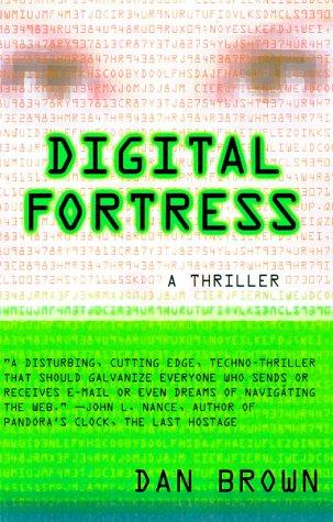 I chose another book cover that I think conveys effective typography. Digital Fortress, as it says in the descriptive quote, is a "techno-thriller". The font used looks very technological. The colors used with the font also gives it a sense of the thrill to come within the book. The layout, paired with the techy font is simple but conveys exactly what the book is about. With the light font in the background, I get a sense of codes. This book is all about trying to break a code, so it works well. Also, the entire cover is in that tech font so it gives a sense of simple unification. The designer of this cover did not try to get too complicated with it by using more than one font. It seems all together effective.
http://www.fantasticfiction.co.uk/images/n11/n56932.jpg
Monday, September 28, 2009
Typography
 This is a magnificent revamp of a classic book cover, by Ruben Toledo. His use of font on this classic book might seem very out of place to some people, but I love it. He makes the words "Wuthering Heights" have a chilling, creepy feeling to them, which I find is very close to the whole climate of the book. He could have made the words curly, and romantic looking, which would come to mind for most people about one of the best romantic novels of all time, but the book has a DARK romance in it, so I think it works well here. Along with the picture, this portrays Emily Bronte and her story in the true dark light.
http://www.mediabistro.com/unbeige/original/toledo%20wuthering.jpg
Subscribe to:
Comments (Atom)