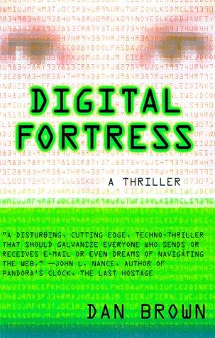
 I chose another book cover that I think conveys effective typography. Digital Fortress, as it says in the descriptive quote, is a "techno-thriller". The font used looks very technological. The colors used with the font also gives it a sense of the thrill to come within the book. The layout, paired with the techy font is simple but conveys exactly what the book is about. With the light font in the background, I get a sense of codes. This book is all about trying to break a code, so it works well. Also, the entire cover is in that tech font so it gives a sense of simple unification. The designer of this cover did not try to get too complicated with it by using more than one font. It seems all together effective.
http://www.fantasticfiction.co.uk/images/n11/n56932.jpg
Good example. This also reminds me a little bit of the Matrix.
ReplyDelete